
Calm

Project
Develop a new way to share free trial
Timeline
2 weeks / 80 hours
Roles
UX Researcher
UI Designer
UX Writer
Deliverables
Research plan
User Interviews
Wireframes - Low, Mid, High Fidelity
Prototype
Usability Testing
Tools
Figma
Miro
Overview
Calm provides meditation, mindfulness, and sleep tools to over 4 million paid subscribers through their mobile app. Current paid users can give away five 30 - day trials to friends with access to premium content (more than the 7 - day free accessible to all new users.) The current flow for sharing the free trials was hidden, felt impersonal, and did not share the full benefits available to new users. To better serve existing and new users, I designed a new way to share a free trial that was engaging, on - brand, and purposeful. (View the prototype now.)
Please note the problems and solutions presented are real and informed by Calm’s user demographic; however, I did not work with Calm.
The Problem
Many adults enjoy the benefits of meditation practice and assistance in falling asleep. The current Calm app design did not highlight the personal connection of sharing these practices and hid the sharing option, resulting in users being unlikely to share their free trials with friends and family and people missing the benefit of having Calm in their life.
This case study explores a new way to share the free trial while facilitating a meaningful interaction between current and new users.
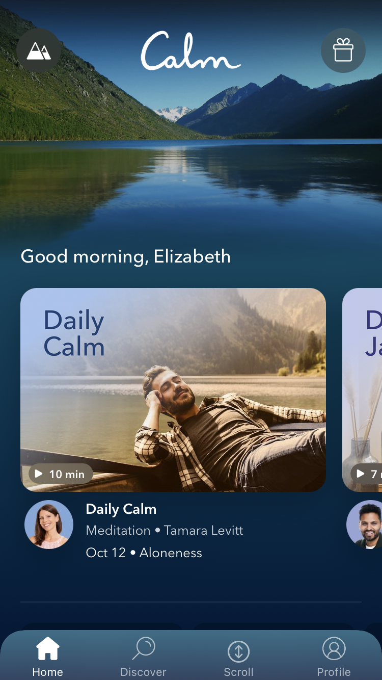
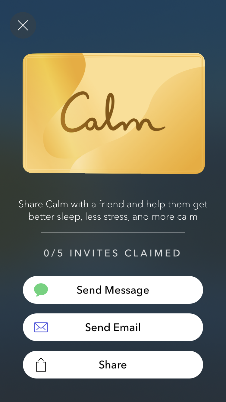
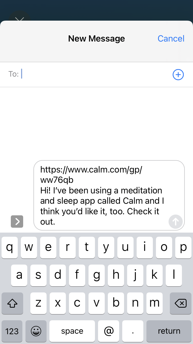
Current flow to share a trial membership for Calm through the app.
Empathize
Process: Competitive Analysis, User Interviews
Research Goals
In this project, I developed a clear business goal of increasing the number of free trials shared + converting trial users into paid users.
I also outlined precise user needs for increasing engagement for the existing user and providing more value for the trial user.
Understanding user motivation and mental modes from multiple points of view were essential.
My research encompassed the following goals:
Learn what factors and decisions go into people using a meditation app.
What influences user selection of a specific app.
What is the impact of using an app on someone's meditation practice (frequency, types of meditations explored, etc.)
What relationship do users have to free trials they can give away (awareness, ease, engagement.)
Who do they believe would benefit from the service they use, and why.
What barriers and challenges do people encounter in sharing their practice with others (internal vs. external factors), and how can we help users overcome these with our design.
User Interviews
Demographic: 5 users (1 male, 4 female)
Ages 25 - 57 (Single, married, with w/o children.)
4 users were between 25-34.
All users currently or recently used meditation or sleep apps.
Method: Interviews were conducted remotely over Zoom (30 minutes)
Topics: Participants were asked about their experiences with meditation and sleep app use as well as how these practices benefit them to investigate the following.
Understand user motivation for using meditation apps and how it benefits them.
Learn how users select who they would share a free trial with, and what would determine them giving it away.
Pain points, learn what challenges users experience in their app experience, and what barriers prevent them from sharing their free trials.
Learn what products currently exist to help users cultivate a regular meditation practice.
Understand what level of desire users feel to share their free 30 - day trials, and what level of desire would they feel to share a meditation experience with someone.
“Sharing my practice is really beautiful, I learn from
other people.”

Impact on Mental Health: 100% of users described the impact of meditation as helping to relieve stress, mood balancing, and helping them to feel more present in their day.
Needs & Frequency: Users expressed their need for stress management and help sleeping. Most meditate once a day in the morning, sometimes using sleep meditations in the evening to help unwind before bed.
Sharing: 100% of users had verbally shared about their practice with others but felt a little uncomfortable.
Only 20% of users had shared a free trial with someone, and it was not for meditation.Barriers: Users shared that the main barrier in sharing free trials with friends was feeling like a salesperson with the current design. They wanted it to feel more personal and meaningful. Many users were also not even aware that they were able to give away an extended free trial.
Interest in Interaction: 100% of users were interested in sharing free trials in a way that is interactive. They expressed that sharing their practice in this type of meaningful way would have a positive impact on them and would increase their likelihood of sharing free trials.
Key Takeaways:
Competitive Analysis


Competitive Analysis revealed the following key insights:
Insight 1) Free Trials All competitors are offering a free trials from 7-14 days.
Action: Calm has the opportunity to stand out in how current users and trial users experience the free trial. All options were generic, lacked personalization, and did not provide a meaningful experience for the person giving away or receiving the trial.
Insight 2) Design The UI of competitor sights all clean and easy to process with varying color palettes.
Action: Calm’s branding has cooler colors which evoke a feeling of relaxation. Keep this going in additional feature designs.
Insight 3) Overwhelm All competitors offer a wide variety of options, however, the paradox of choice can often paralyze a user.
Action: Develop an easy way for new users to be guided with personalized options to reduce overwhelm and increase time using the product.

Define
Process: Affinity Map, Personas, Product Road Map, User Flow, Task Flow
Affinity Mapping & Personas
Affinity mapping (see Affinity Map) and analysis of user interviews uncovered insights into user needs, and decision making behavior.
The Millennial Meditator : The meditator here for stress management and sleep help. They like to meditate alone, but want to learn from others and are unsure how to share their practice. (See the Persona)

The Millennial Meditator
“Meditation helps me work better, and work is also why I need meditation.”
Product Road Map,
User Flow & Task Flow
Developing a Product Roadmap lead to the creation of a personalized invitation to a free trial that engaged existing and trial users in new ways.
This included
A way for users to share the needs of their friends
Have Calm generate a 30 - day suggested meditation guide for the trial user
Share how meditation has helped the user personally
Offer a meditation the new user might like to go with the invite
Based on the user needs of the persona created, the following User Flow and Task Flow were developed.
Existing User Flow: A user browses for and listens to a meditation
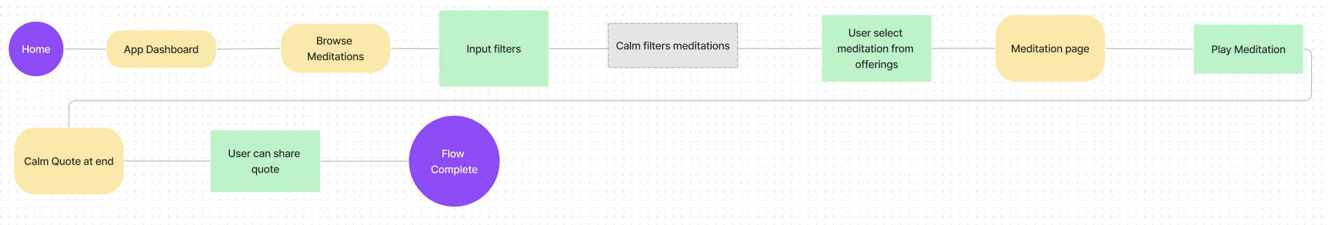
Task Flow 1: A user shares a free trial in a personalized and engaging way that benefits the trial user.

Task Flow 2: Scheduling a shared meditation with a new user.
This second task flow was not built out due to time, but reflects a next step I would take in designing as it captures a desired feature from user interviews that engages current and trial users.

Design (Ideate & Prototype)
Ideate Process: Low Fidelity Sketches, Mid Fidelity Wireframes
Prototype Process: Branding, UI Kit, High Fidelity Wireframes, Working Prototype
Low Fidelity Wireframes
To work through the problem of an inefficient method of sharing, I designed a low fidelity task flow for sharing a free trial. This flow began when a current user completed a personal meditation. The current user can customize the invitation by selecting a meditation and sharing how Calm helped them personally in more detail. These design choices were drawn from user interviews and insights around what drives people to share: opportunities to create a meaningful connection.
Screens: Home page, Event Booking task flow.
Outcome: Prioritized design elements noted in user interviews and research.
Share Calm with a friend after a meditation
1) Moved CTA to directly underneath the after-meditation quote.
2) Customization of top 3 topics from categories Calm uses.
3) Personalize by sharing meditation and how Calm helps you.
4) Flow ends with more personalized recommendations for current users.
Invite a friend


Mid Fidelity Wireframes
In this set of frames I utilized both existing Calm UI (cards, general layout, etc) as well as created my own elements for how the design was developed. I focused on building out the buttons
Screens: Inviting a friend to Calm, sharing recommendation
Outcome: Designed elements from Low Fidelity wireframes and matched Calm UI.

Calm Branding, UX Writing, & UI Kit
Branding: I utilized the existing branding to stay consistent with the experience of using Calm.
Calm has a very clear style guide that I could draw from for font, matching color choices including their signature gradient transition Many articles referenced that Calm is specifically designed to avoid dark UI patterns. Believe it or not, they want you to spend time off the app! This meant I needed to create intentional ways of making the interactions purposeful, but with a clear endpoint.
UX Writing: A challenge was ensuring that things felt on brand for Calm’s UX writing.
They are intentionally not too “sticky,” and things needed to feel friendly, approachable, and clean.
As I wrote, I would continually reflect on if my writing was as concise as possible while remaining warm, friendly, and engaging. Intentional language choices created the largest impact with the smallest word count.
UI Choices : I recreated the entire Calm UI for this project.I had initially used screen shots for larger background elements but felt I could create much stronger work, which is reflected in each element I designed. Card systems were designed based on the existing Calm UI, and all original elements were rebuilt.
Calm has a strong UI style format for me to draw from for font, color gradients, and image types. I created new elements (buttons, meditation cards, etc.)
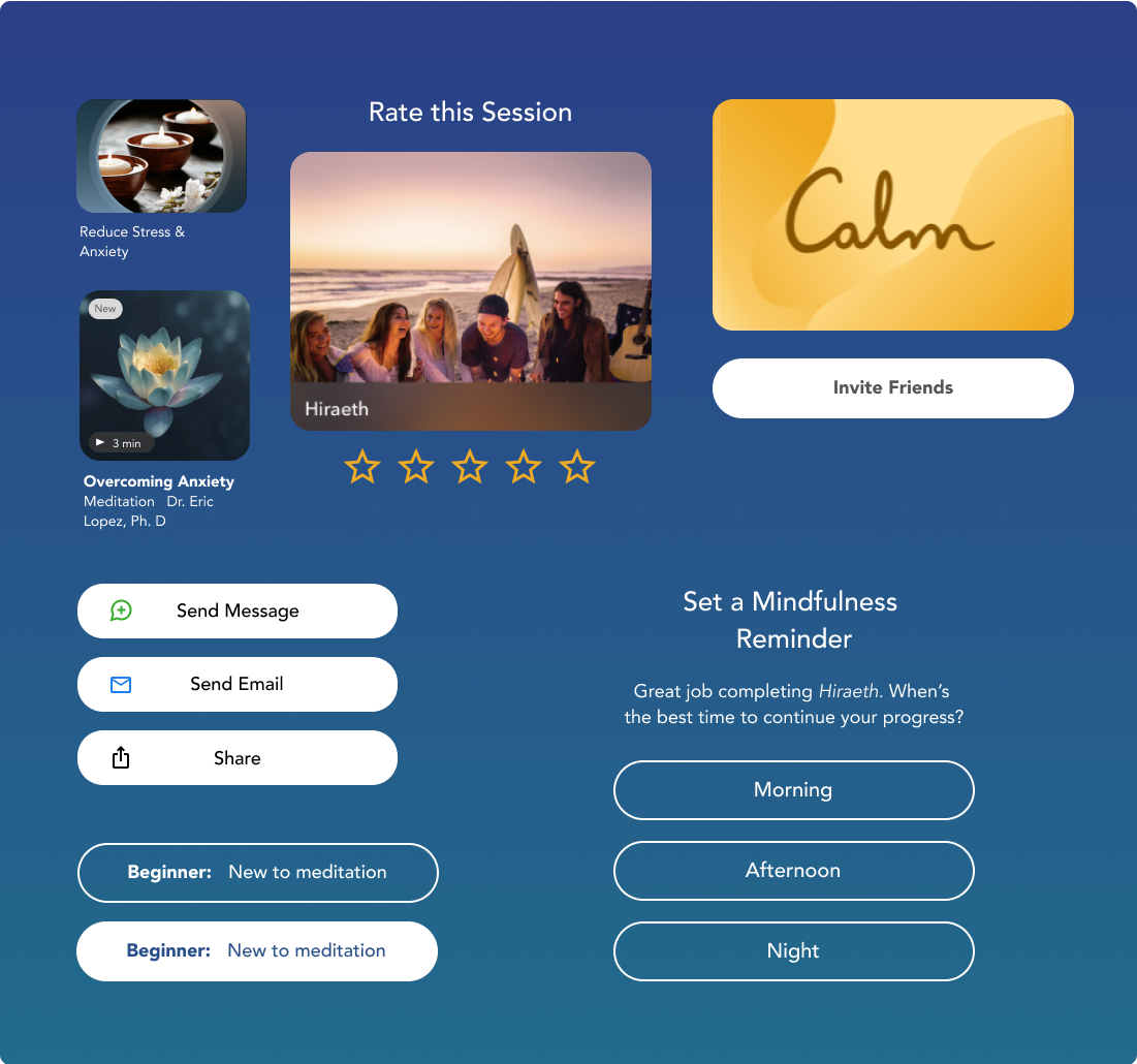
High Fidelity Wireframes
Bringing together the Calm UI system and my mid-fidelity designs, I was able to create a seamless, on-brand experience in the high-fidelity wireframes. The task flow for inviting a friend to experience a free trial of Calm with a customized meditation and message was a combination of on-brand UX writing and image choices.
Screens: Invite a friend, Share experience level, Customize invite with meditation
(See the prototype)
Outcome: Created a seamless match for Calm UI to showcase a new task flow for inviting a friend, developing a 30-day calendar, and sharing meditation with your customized invite.

Share Calm from end of meditation

Sharing experience level

Customize invite with meditation
Test
Process: Usability Testing, Testing Summary, Priority Revisions
Usability testing was conducted to test both the emotional reaction to the task flow design as well as gather quantitative data for how this new method would impact users desire to share a free trial.
Demographic: 5 users (1 male, 4 female)
Ages 25 - 37 (Single, married, with and without children)
All users currently or recently have used a meditation app
Method: Interviews were conducted remotely over Zoom (30 minutes)
Task: Participants were given a persona and a specific task to complete.
This task was to customize a free trial invite to Calm for their friend Michelle.
Qualitative Goals
Determine if users can quickly move through the platform with ease to share a trial membership.
Evaluate emotional reaction to features, what brings delight or frustration.
Quantitative Goals
Determine the time it takes for a user to complete the task of inviting a friend to Calm
Determine the rate of completion for each task, and determine the rate of user errors.
Determine how likely a user would be to use this feature in real life
Usability Testing
This new feature tested exceptionally well in usability testing!
Users were visibly enthusiastic as they completed the task of inviting a friend through the new method. There were no places of confusion or areas where users experienced challenges completing the task.

Testing Results
100% of participants
rated ease of use
8/10 or higher
100% of participants found this a more engaging method to share free trials
Ease of Use & Engagement
80% of participants
rated likelihood giving away a free trial with
new method 10/10.
20% of participants rated likelihood 8/10.
Likelihood of Use
100% of users wanted to share the invite via text message
Preferred Sharing Method
Users Said
“This is a great idea, I can’t think of anything like this in other apps. It was intuitive and engaging. This would build happiness into the brand.”
“It felt more engaging that just sending a link. When I was making this, I feel like I am creating something that they would want to use. I’m taking the time to make something for them.”
“It felt like we (Calm) care about your relationship with your friend.
Using the names felt personal, and I appreciated the variety of options to choose from. ”
As this product tested very well with users repeatedly commented that they would absolutely use this new method to share a free trial, only minor iterations were necessary. I focused on iterations regarding information architecture and visibility.
Based on user feedback the following iterations were prioritized.
Iteration 1) Information Architecture: Feedback indicated this page needed the details of a membership prioritized and moved higher to catch users eye
Impact: What a free trial offers is now highlighted first, user clearly understands trial.
Priority Iterations

Before - General info before details

After- Text bolded and details shared first
Iteration 2) Visibility: Although the check marks on selecting areas was visible,
I wanted to enhance the visibility with a stronger contrast.
Impact: Increases accessibility and visibility of selections

Before - Blue check was not as visible

After- Green check has greater visibility and customer recall of green indicating “Go” / selected
Conclusion
Process: Project Summary, Next Steps & Future Iterations
Project Summary
This project was a great experience in writing and designing on brand with an existing product. My solution was well received by users, and I truly stand by my design as a solution for Calm to envision how free trials are shared and received.
The UX writing in this project was challenging yet extremely fun for me. I pushed myself to think in the voice of Calm - clear, concise, warm, and engaging. I believe the user testimonials reflect how seamlessly I stayed on brand in this design with the comment, “It felt like I was just on Calm and I had never seen these pages before."
I look forward to working with future brand designs that may challenge me, even more to write in the company’s tone.
Next Steps & Future Iterations
With additional time I would continue to test the new iterations with users to receive additional feedback and validation of the impact of the changes’ impact. This could also include additional iterations such as seeing if the task could be reduced by one screen, and potentially adding a progress bar to test user responses.
I would also want to build out the task flow of a user receiving an invitation to complete a shared meditation, as this received significant interest in user interviews. I believe this new feature would add value to the Calm brand and tap into the desire for community and focused sharing within the app.


“Whatever the tasks,
do them slowly and with ease,
in mindfulness.”
-Thích Nhất Hạnh
View more of
my work

Denver Outdoor Adventure Company
Case Study
Plug In Case Study