
Denver Outdoor
Adventure Company
Project
Responsive Website
Timeline
2 weeks / 80 hours
Roles
UX Researcher
UI Designer
Branding
Deliverables
Research plan
User Interviews
Branding & UI Kit
Wireframes - Low, Mid, High Fidelity
Prototype
Usability Testing
Tools
Figma
Miro
Optimal Sort
Overview
Denver Outdoor Adventure Club provides rentals and organized events for outdoor adventures (paddleboarding, kayaking, snowshoeing, hiking.) The existing site for DOAC was not clearly communicating the products and services offered to users. Information was unclear, not organized effectively, and hard to visually process with inaccessibility in the design. (View the prototype now.)
Please note the problems and solutions presented are real and informed by DOAC’s user demographic, however I did not work with DOAC.
The Problem
Many adults enjoy the physical, mental, and emotional benefits of being active outdoors. The current website design made it challenging for users to books services, costing the business revenue and depriving users of the opportunity to experience the full range of services provided.
This case study explores increasing conversion of members and single season users into multi season users, allowing users to experience the joy and benefits of being active all year long.
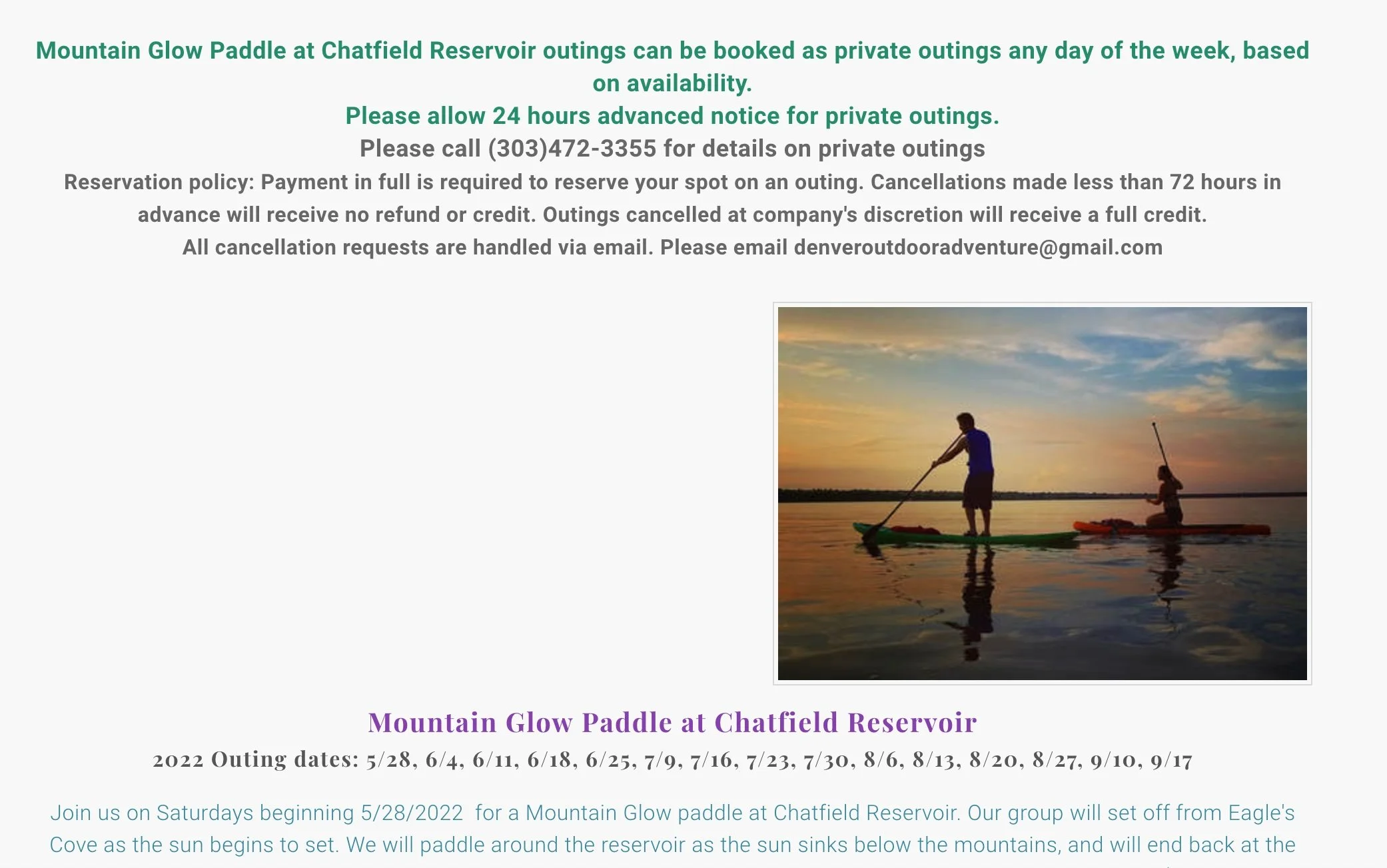
Current site for Denver Outdoor Adventure Company
Empathize
Process: Competitive Analysis, User Interviews
Research Goals
In order to best meet business goals and user needs it was important to understand user motivation for renting equipment and joining group outings.
My research encompassed the following goals:
Learn how users select what types of outings they will join.
Pain points, learn what challenges users experience in renting equipment and joining group outings.
Discover what motivates users to rent vs. buy paddle boards.
Learn what products currently exist to help users rent equipment and participate in group outings.
Understand what level of desire users feel to be active year round vs seasonal and what will get users to stay in a year round membership
User Interviews
Demographic: 5 users (3 male, 2 female)
Ages 31 - 56 (Single, married, with and without children.) All users currently rent or own paddleboards.
Method: Interviews were conducted remotely over Zoom (30 minutes)
Topics: Participants were asked about their experiences with renting and purchasing paddleboards as well as their participation in group outdoor activity based events to investigate the following.
Learn how users select what types of outings they will join.
Understand pain points, learn what challenges users experience in renting equipment and joining group outings.
Discover what motivates users to rent vs. buy paddle boards.
Learn what products currently exist to help users rent equipment and participate in group outings.
Understand what level of desire users feel to be active year round vs seasonal and what will get users to stay in a year round membership

“I just want to show up
with sunscreen.”

Impact of Outdoor Activities: Users described the impact of being active outdoors as increasing their quality of life, positive impact on their mental health and mood, and stress relieving.
Guided Outings: 100% of users were interested in guided outings for winter sports such as snowshoeing, with an emphasis on differentiating events for specific skill levels.
Membership: 80% of users expressed that having a membership with a discount on services would make them more likely to be active outdoors year round.
Decision Making: Ease of booking, safety and certification of staff, and the ability to clearly identify what to expect from an event prior to booking were of high priority in users decision making process.
Key Takeaways:
Competitive Analysis

Competitive Analysis revealed the following key insights:
Insight 1) Membership: All competitors are offering a membership which includes a discount on services and classes etc.
Action: DOAC needs to better highlight this feature with a clear CTA as it is currently not easily visible.
Insight 2) Design: The UI of competitor sights is much easier to visually process with clear, cohesive card systems used for events and classes.
Action: Design UI to reduce the cognitive load of the user, develop a strong card system to better showcase DOAC offerings and event details.
Insight 3) Four Seasons: Activities are categorized by season and type of activity. Not all local competitors are offering Fall/Winter Events & Rentals.
Action: Create a stronger separation between seasonal activities, and between rentals and events. Opportunity to stand out with Winter season events.
Define
Process: Affinity Map, Personas, Site Map, Product Road Map, User Flow, Task Flow
Affinity Mapping & Personas
Affinity mapping (see Affinity Map) and analysis of user interviews uncovered insights around user needs, and decision making behavior.
Two distinct user personas were developed. (See the Personas)
The Emerging Explorer: The casual paddleboard renter also interested in guided winter activities.
The Seasoned Adventurer: The experienced paddleboard owner and water sport enthusiast who wants to take their winter activity knowledge to the next level.

The Emerging Explorer
“Safety is really important
to me.”
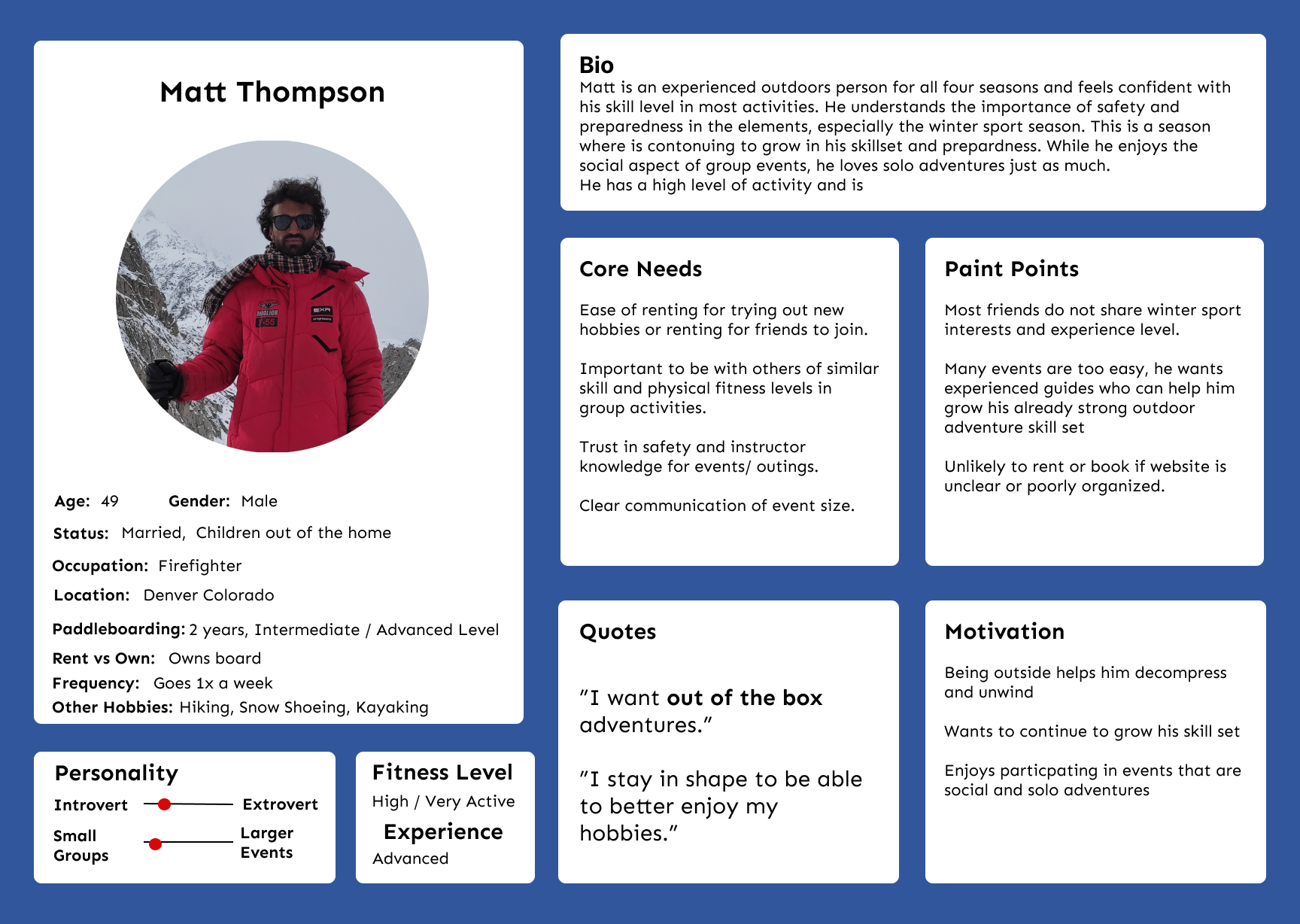
The Seasoned Adventurer
“I need out of the box adventures.”
Site Map
Design Method: Card Sorting (5 participants) was used to validate the design of the site using terms generated from user interviews and competitive analysis. (See the Site Map)
Outcome: Participants sorted cards with very similar outcomes, which informed the site map developed.
Goal: Allow users to browse services offered with ease and organization.

User Flow & Task Flow
Based on the needs of the two personas created, the following User Flow and Task Flow were developed.
These two flows were combined by creating a task flow where a user registers for an event and adds on a membership to the purchase.
User Flow: A new user signs up for a memberships and registers for an event.

Task Flow: A new user registers for an a winter snowshoeing event for their skill level.

Design (Ideate & Prototype)
Ideate Process: Low Fidelity Sketches, Mid Fidelity Wireframes
Prototype Process: Branding, UI Kit, High Fidelity Wireframes, Working Prototype
Low Fidelity Wireframes
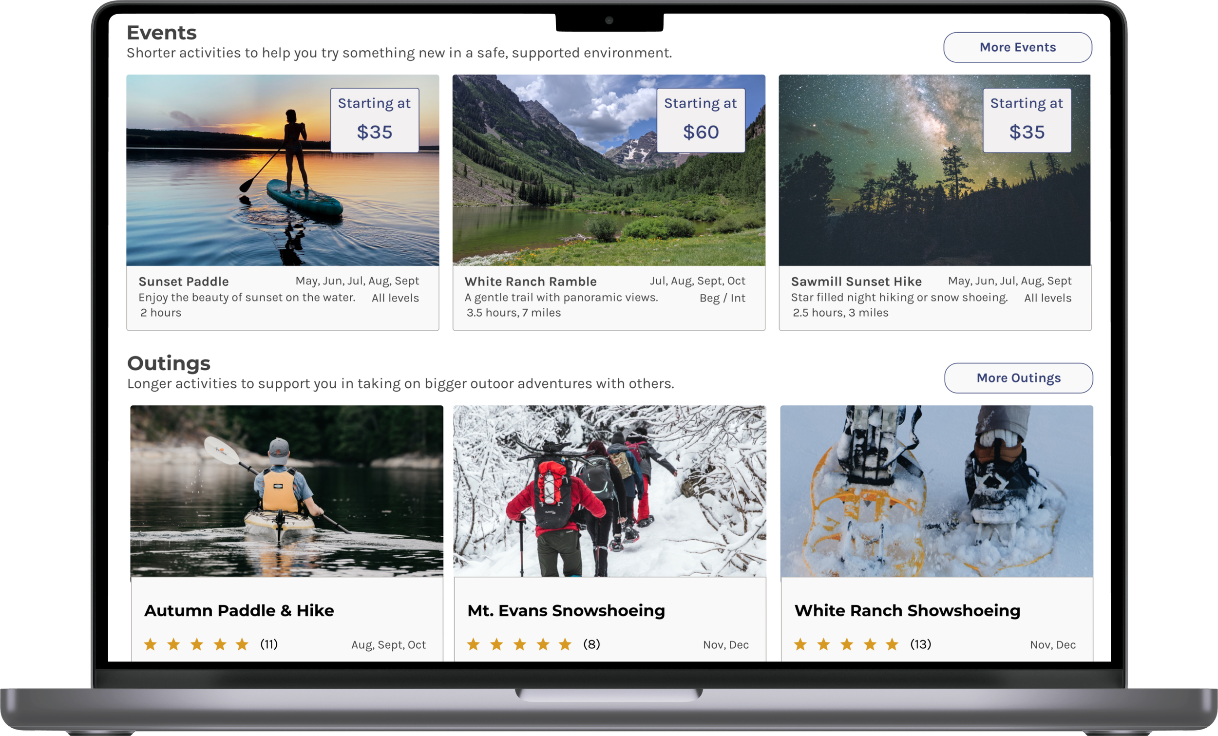
I designed low-fidelity wireframes to work through the task flow for booking an outing, allowing me to focus on the needs of both personas. Research from user interviews regarding what were the core needs of users to feel confident in the decision to book an event informed page designs in the following ways. Home Page, users expressed wanting to know about the company and quickly see the breakdown of services which is why I have the categories Rentals, Events & Outings, and Custom Events & Outings. On the events specific page, users wanted to easily identify logistics like date, time, and skill level, which influences the design of cards used for each event, as well as the more extensive Event Details Page, which showcased more details and reviews.
Screens: Home page, Event Booking task flow.
Outcome: Prioritized design elements noted in user interviews and research.
Home Page
1) Highlighted Membership with CTA and separate navigation tab.
2) Clear separation of rentals, events and custom events.
3) Added Our Staff, Safety, and FAQ’s to home page based on user preferences.
Events Booking Flow
1) Created card system to lower visual processing load and clearly communicate information and utilize responsive system for mobile viewing.
2) Details such as event title, fitness level, experience level, and reviews of the event are highlighted based on decision making criteria from user interview responses.

Homepage
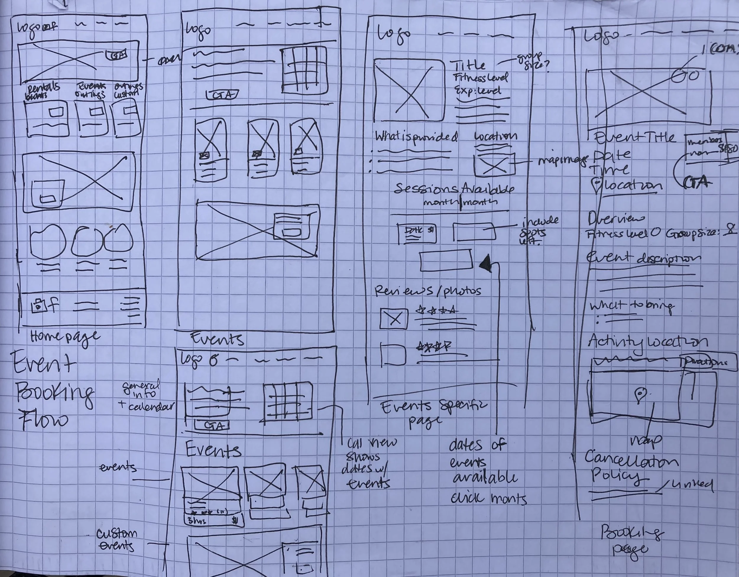
Events Booking Flow
Branding & UI Kit
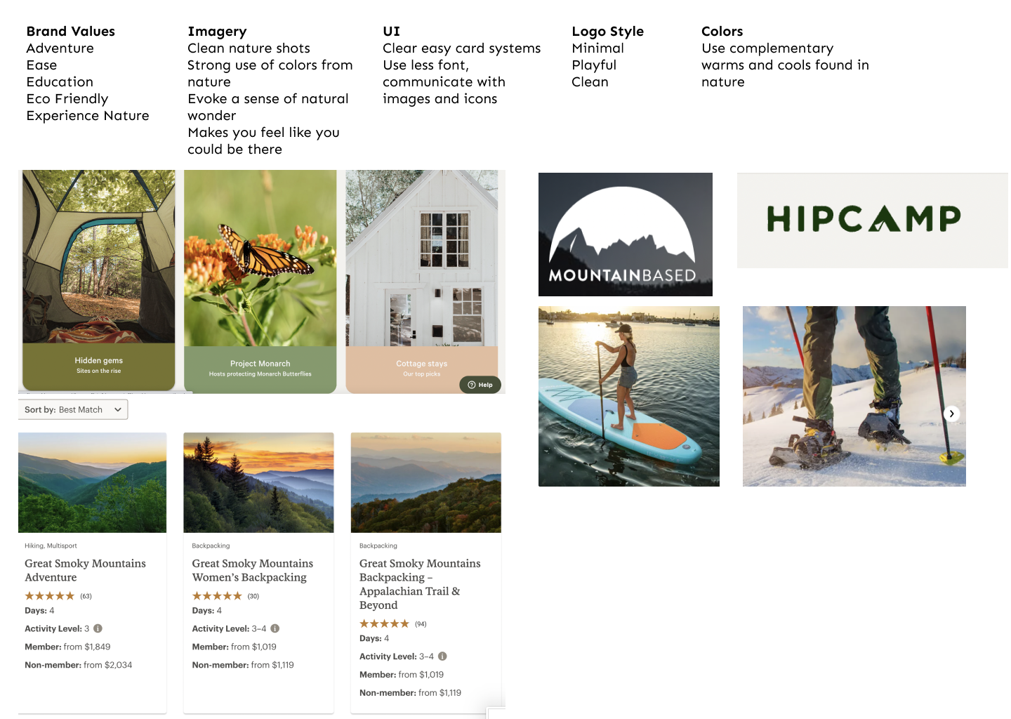
Branding: I developed the following Brand Values for DOAC from current copy and user interviews.
Adventure, Ease, Education, Eco Friendly, Experience Nature (See the Mood Board.)
Key factors in branding were simplicity in design, nature inspired color palette, and imagery that made you feel like you were at the event. These led to the following UI choices.
UI Choices : Clear fonts were chosen to let the images of this site tell a story and shine.
Responsive card systems with key information were created to make the site easy to visually process for the user.


Mid Fidelity Wireframes
I drew on my user research and competitive analysis to inform the Mid-Fidelity Wireframes. In creating the Home Page, I worked to best highlight the CTA’s to draw attention to the calendar of events and member events, as these were not visible in the existing design but were key features of competitors. User research indicating that safety, knowing who the staff were, and being able to quickly see FAQs were top priorities informed the bottom section of the Home Page. Card specifics were developed in further detail to highlight areas such as fitness level and experience level at a glance. The Event Details page allows the user to view the dates a specific event is available, see reviews, and make an informed decision to register for an event.
Screens: Home page, Event & Outings, Event Details
Outcome: Clearly designed elements from Low Fidelity wireframes.

Homepage

Events and Outings Page

Event Details Page
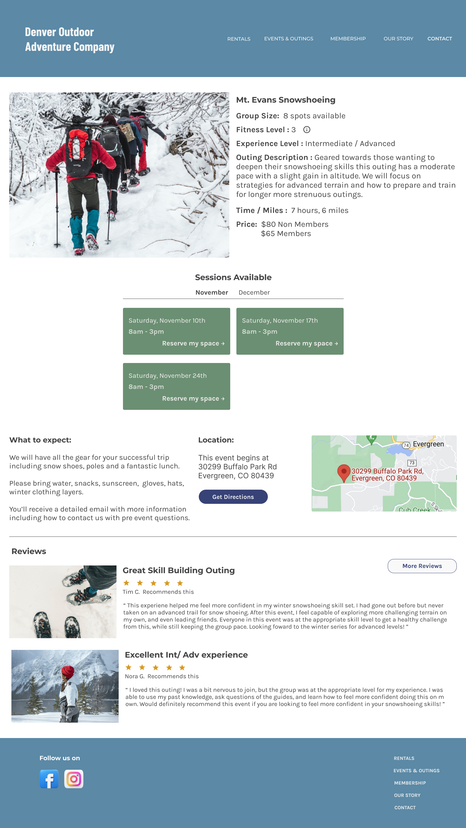
High Fidelity Wireframes
With minor layout edits from the mid-fidelity wireframes, it was time to bring the pages to life. Through careful image selections designed to make the user feel like they were at the event paired with a color palette intended to evoke a connection to nature, the high-fidelity wireframes took form. These pages are crisp, clean, and impactful in communicating visually and through text the core information users needed to navigate the site and make decisions.
Screens: Home page, Event & Outings, Event Details (See the prototype)
Outcome: Added strong visual elements to make each event feel inviting and reflect feeling like you are at the event, clearly communicate information needed for user decision making.

Homepage

Events and Outings Page
Events Details Page
Test
Process: Usability Testing, Testing Summary, Priority Revisions
Usability Testing
To represent the diverse range of users, three participants embodied The Emerging explorer persona, and two participants represented The Seasoned Adventurer persona. The personas represent an authentic portrayal of customers booking services on this site. The testing was extremely positive with all users able to complete the task with ease, and all users providing positive commentary on their experience. The image selection was commented on by multiple users which affirmed my selection of impactful images to make the user feel like they were at the event.
Demographic: 5 users (1 male, 4 female)
Ages 27 - 51 (Single, married, with and without children) All users currently rent or own paddleboards.
Method: Interviews were conducted remotely over Zoom (30 minutes)
Task: Participants were given a persona and a specific task to complete.
This task was to register for the Mt. Evans Snowshoe Outing while adding a membership.
Qualitative Goals
Determine if users are able to move through the platform with ease to register for an event.
Evaluate emotional reaction to features events and outings, overall website design and layout, what brings delight or frustration.
Quantitative Goals
Determine the time it takes for a user to complete the task of registering
for an event.Determine the rate of completion for each task, determine rate of user errors.
Determine how likely a tester would be to use DOAC in real life.

Testing Results
100% of participants
rated ease of use
9/10 or higher
Ease of Use
100% of participants
rated likelihood of use
8/10 or higher
Likelihood of Use
4 minutes, 14 seconds
(ranging from 1.36 to 6.15)
Average Time
“It is laid out intuitively. Everything is where I expect it to be. This looks compelling.”
Users Said
“Usually my anxiety pings me if something is missing, but this has all the information I would want and need.”
“I liked the pictures, it really felt like they were from the actual event. It felt real and made me think about being at the event.”
Priority Iterations
Based on extremely positive user testing results, there were only minor iterations needed on this design. I chose to focus on iterations that would address two main areas. These were user decision making / comfort in booking an event, as well as user peace of mind after booking the event. This led to the following two iterations. Although they are smaller changes, they address core user needs to feel confident before and after booking an event.
Iteration 1) Event Details: Add event instructor showing a link to staff bios.
Impact: Increases user confidence in staff leading the event,
highlights staff qualifications, increasing likelihood of user booking event.

Before - no email was included

After - Email is shared and bolded to easily identify
Iteration 2) Email in Checkout: Add participant email to the final page indicating what email address the confirmation email was sent to.
Impact: Eases the thought that user may have input the wrong email.
Allows user to self correct error and contact DOAC if they realize they put the wrong email in.

Before - No instructor listed

After - Instructor listed with link to bio
Conclusion
Process: Project Summary, Next Steps & Future Iterations
Project Summary
This project was very interesting for me, both as a researcher and designer. I loved listening in interviews to hear the impact that outdoor activities had on participants. Taking those insights and redesigning the DOAC site to better highlight the opportunities to stay active all four seasons and bring information forward that was previously disorganized was a meaningful project.
I enjoyed the challenge of serving users while also connecting the design to supporting business goals in this case study. Though my research, design, and testing process I was able to validate that my new design encompasses both the true user needs, and would support DOAC capturing users for all four seasons.
Next Steps & Future Iterations
With additional time I would continue to test the new iterations with users to receive additional feedback and validation of the impact of the changes made.
Potential future additional iterations could include adding features like the ability to “share event with a friend” from the event details page, and building out the events calendar page with the ability to filter by event types.
I would also conduct ethnographic studies on actual outings, interview participants after events, and update the site to reflect the findings from this new research.
“I go to nature every day for inspiration in the day’s work.” - Frank Lloyd Wright
View more of my work
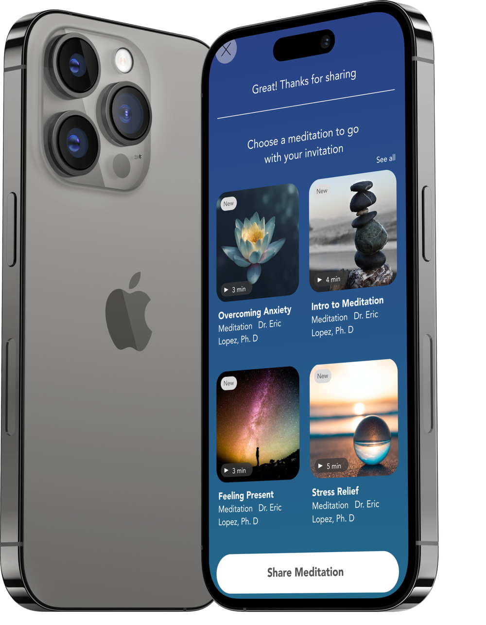
Calm Case Study
Plug In Case Study