
Plug In

Project
End to end App
Timeline
2 weeks / 80 hours
Roles
UX Researcher
UI Designer
Branding
UX Writer
Deliverables
Research plan
User Interviews
Branding & UI Kit
Wireframes - Low, Mid, High Fidelity
Prototype (Digital and Paper Testing)
Usability Testing
Tools
Figma
Miro
Paper prototyping
Overview
More and more adults are not pursuing the “traditional” retirement path.
They may no longer be working full time, but they are seeking ways to stay intellectually and creatively engaged in the world around them. Retirement can often mean a change in location and daily schedule of activities which can unintentionally create a loss of connection. Plug In matches older adult professionals with younger people who are interested in learning from those who have more professional and lived experience to share with them. It also provides a way for adults to tap into the events, activities that are happening in their community as a proactive way to combat the often isolating side of retirement.
Plug In to your Community, Plug In to Mentoring. (View the prototype now.)
The Problem
Many older adults who have transitioned into retirement feel unengaged intellectually and creatively in this new phase of life. They experience isolation, lack of stimulation, are at a higher risk of depression, and often experience a lack of purpose and miss feeling of use to others. With a wealth of life and professional experience to draw on, they are often an underutilized and overlooked source of wisdom.
This case study explores how a mentoring service can also connect users to engaging activities and local resources as a proactive way of creating mental and emotional engagement for retired adults.

Retirement puts older adults at a higher risk for loneliness, depression, and more.
Empathize
Process: Competitive Analysis, Secondary Research, User Interviews, Ethnographic Study
Research Goals
In order to best meet business goals and user needs it was important to understand user motivation and pain points in the retirement phase of life.
My research encompassed the following goals:
Understand the mental mode of someone who has recently entered retirement.
Learn how users select what activities they want to spend their time participating in.
Pain points, learn what challenges users experience in being involved and engaged intellectually and socially.
Discover what motivates users to want to share their life and professional experience, and what would prevent or discourage them from doing so.
Learn what products currently exist to help users share their knowledge in a mentorship capacity (locally and online.).
Understand what level of desire users feel to be involved in sharing their professional experience in a mentorship capacity.
Uncover what sorts of new learning opportunities would excite and engage users.
Competitive Analysis
Competitive Analysis of 3 sites for mentoring as well as sites targeted at senior users.
“AmeriCorps Seniors volunteers experience decreased anxiety, depression, and loneliness. 84% of volunteer report stable or improving health after one year of service.”

Ethnographic Study
Hosted by the Lafayette Senior Center
Time: 1.5 Hours
Event: Guided Tree Tour with CU Boulder
Purpose: To observe users in action

User Interviews
Demographic: 5 Adults, All female
Ages 61-83 in early, mid, and late retirement. In person, and on phone
Time: 3.5 Hours
Purpose: Learn the mental mode, joys, and challenges of users in retirement.


Isabella, 70 Interview Participant
Geri, 83 Interview Participant
Impact of Feeling Helpful and Useful: 100% Users described that being involved as a mentor would have a positive impact on their lives and feel good about giving back.
Purpose & Learning: All users expressed that mentorship and helping other people would tap into a sense of purpose and intellectual stimulation that is not found in their other daily interactions. They wanted to still be engaged in giving and helping, as well as continue to learn and enrich themselves.
Risks of Retirement: Research shows that people entering retirement are at a much higher risk of depression, loneliness, and cognitive decline. Keeping users mentally stimulated and contributing has shows to reduce the negative side effects found in retirement.
Who is Plug In for: Plug In is for people who want to give back through professional mentorship and may be in early to mid retirement. They are seeking ways to be engaged in intergenerational mentoring, as well as be involved in local events and activities.
Challenges: A hard moment was realizing that the mentor side of Plug In may not be accessible to users who have already experienced a cognitive decline. This could transition to a “coffee talk” for stimulation and they would still benefit from being connected to community resources.
Technology: Plug In would need to be designed intelligently to avoid tech barriers seniors currently face and to empower them to use the services.
Key Takeaways From Extensive Research:
“Social connection is
so important. It is almost a part of a health plan.”

Katherine Erstad
Senior Services Coordinator, Programs
City of Lafayette, Colorado
Interviewed for this project
Process: Affinity Map, Personas, Site Map, Product Road Map, User Flow, Task Flow
Define
Affinity Mapping, HMW & Personas
Affinity mapping (see Affinity Map), How Might We statements and analysis of user interviews uncovered insights around user needs, and decision making behavior.
The following persona emerged. (See the Persona)
The Saavy Senior: The Senior who is in early to mid retirement, travels, is engaged with the community and wants to continue learning while giving back and helping others. Has a strong career to draw on for mentoring sessions.
With additional time a persona for multiple mentors as well as mentee would be developed. This persona was the most critical to address to create an MVP.

The Saavy Senior
Site Map, User Flow & Task Flow
Based on the needs of the persona created and the Product Features Map and Site Map developed , the following User Flow and Task Flow were created.

User Flow: A member accepts a mentorship session request (on the touch screen)
Task Flow 1: A mentor accepts a mentee call and rates the call (ipad)

Task Flow: A mentee books a session with a mentor (iphone)

How might we create proactive ways to engage our Senior population to prevent cognitive decline, loneliness, and depression?
How might we rethink how we connect Seniors to technology and create solutions that grow with a user through multiple stages of their development?
Design (Ideate & Prototype)
Ideate Process: Low Fidelity Sketches, Mid Fidelity Wireframes
Prototype Process: Branding, UI Kit, High Fidelity Wireframes, Working Prototype
Low Fidelity Wireframes
3 Task flows were designed with an emphasis on reducing technology barrier, accessibility, and ease
Mentor Flow on Touch Screen (to be put in Senior Center)
1) Emphasis on interaction and making the interface easy, large interface and buttons.
2) Categories used already exist with Senior services from City of Lafayette
3) Card to tap login eliminates forgetting login, create autonomy with assistance available at the in person location, taken from user interviews and research.
Mentor Flow on iPad
1) Clear reminders of intention of session
2) Larger fonts, reduction of buttons to create ease of experience
3) Rating as accountability desired from user interviews
Mentee Flow on iPhone
1) Clear mentee profile with details of experience, availability and way to book
2) Scheduling is easy based on mentors availability
3) Resources to be prepared for the interview (based on user interviews)


Ipad: Mentor Accepts and rates a call

Iphone: Mentee selects mentor and books call
Mid Fidelity Wireframes
Screens: Mentor accepting call flow,
Outcome: Clearly designed elements with emphasis on font and button size for accessibility as well as reducing cognitive load for user with what is shown on the screen
Touch Screen: Accept a Mentor a Session

Branding & UI Kit
Branding: I developed the following Brand Values for Plug In based on user interviews and market research. Trustworthy, Ease, Learning, Connection, Purpose (See the Mood Board.)
Key factors in branding were simplicity in design to ease the cognitive load of the user.
Large simple icons were used to communicate clear meaning to the user.
UI Choices : Clear fonts were chosen for visibility and accessibility. Font sizes were intentionally enlarged to make it easier for users to read information.
A warmer color palette leading with red was chosen as this is a preferred color within the senior demographic both for contrast and visibility as well as the energy of the color.
Visibility and accessibility were researched extensively to make this product functional for a wide range of users.


High Fidelity Wireframes
Designing 3 separate task flows in high fidelity, two digital and one paper prototype for testing was no small feat. Having three different designs to complete really challenged me to focus on the core elements necessary for each task flow to be part of an MVP. Image and text size, as well as using color in my design to enhance accessibility was a top priority.
Screens:
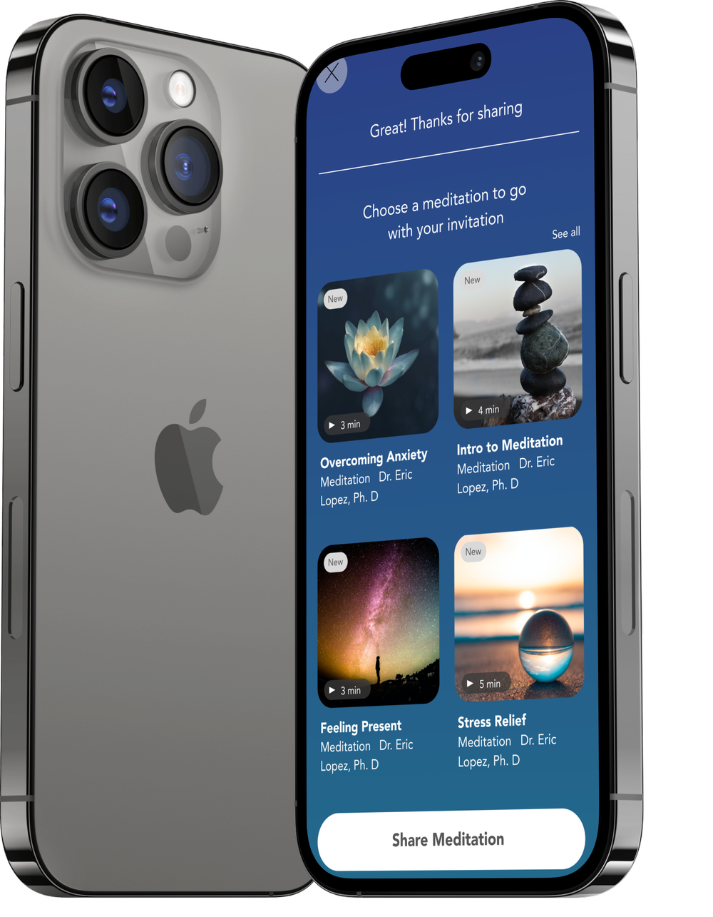
See the Mentor Flow: Accepting and rating a Call prototype
See the Mentee Flow: Booking with a Mentor prototype
See the Touch Screen Flow: Mentor Accepts a Session Request Paper Prototype
Outcome: Brought the screens to life with imagery and detailed designs from the low and mid fidelity wireframes. Focused on accessibility and visibility as well as clear indications for mentor to be prepared based on user interview requests.
Features for conversation starters and security.


Test
Process: Usability Testing, Testing Summary, Priority Revisions
Usability Testing
Testing for this product was conducted at the Lafayette Senior Center as it was a central part of my user recruitment and a part of the users' daily lives. This location-based testing allowed me to capture qualitative data in the following ways.
How would users feel if the paper prototype was a real digital screen at the Senior Center? How would knowing they had tech support available from Senior Center staff impact their likelihood of use? Where were the best locations within the center to place the station? Quantitative data regarding user experience was also captured in this testing session.
Demographic: 4 users (2 male, 2 female), Ages 69 - 73
All in early to mid retirement
Method: Interviews were conducted in person at the Senior Center to test 2 task flows. Ranged in time from 45 mins to 1 hour. Much of this was discussion.
Tasks: Participants were given 2 tasks
1) Accept a mentor session request on the touch screen flow.
2) Complete a mentor session on the ipad flow.
Qualitative Goals
Determine if users are able to move through the platform with ease to register for an event.
Evaluate emotional reaction to features for ipad and touch screen
Quantitative Goals
Test the task of signing in and accepting a mentor session on touch screen
Test the task flow of completing and reviewing a mentor call
Test visual UI how the task flows


The Testers

Mary, 73

Isabella, 70

Scott, 73

John, 69
The Paper Prototype

Home Screen / Login

Accept mentee request

Send a message

Task Complete
Testing Results
100% of participants rated ease of use
7/10 or higher
and said a second use would be even easier
Ease of Use
50% of participants
rated likelihood
of use 10/10
50% rated 8/10 or higher
Likelihood of Use
100% of participants were able to complete the two tasks.
Completion of Tasks
Users Said
“Don’t limit this to only Seniors.
This is a great product that many people would benefit from.”
“I would feel happy knowing I was possibly helping someone and giving them more guidance than I had.”
“This feeds people and gives them interactions they need.””

Isabella explains why custom messages are best
This group was more than happy to give extensive feedback. They were engaged, excited and eager to try out the tasks. It was visible how much energy was being received just from the task of testing, let alone actually engaging in the mentoring.
This was a successful experience!
Challenges: Many users were not able to accurately guess what certain icons meant. An easy solution to this would be to ensure there is an onboarding video with a tutorial of the meaning and function of each icon.
One user challenged the idea that a mentoring service should be connected to things like activities noting “These feel like two separate things” but that they were interested in both. When posed with a solution to Plug In to “Community” and “Mentoring” on the main touch screen, this made the user happy to still have access to both but to separate the mental mindset for the two tasks.
This is also where the service is a proactive measure for staying mentally and emotionally healthy and engaged and could be marketed well to Seniors.
Successes: Once they gained confidence in exploring, users were able to navigate the tasks with ease. All noted that a second use would make things even easier for them. Emotional responses were positive and made users feel valued, purposeful and excited to engage in a mentor opportunity. Users were also excited at the chance to have new activities suggested to them based on their interests though this service.
All users said that being able to access this from home on a personal device or come in to a location to access the services with tech support would make them more likely to engage in the service. (This also addressed technology access barriers and created an equitable experience for all Seniors.)
Impact: This product had a positive experience on all users. They were enthusiastically encouraging me to try to build out the product beyond project use.
Observations & Notes
Priority Iterations
As this product tested very well with users, only minor iterations were necessary.
Based on user feedback the following iterations were prioritized.
One consistent theme across all five users was confusion around the function of the “Reveal” icon.
It did not communicate to them that this was meant to be a conversation starter. In a testing session I mentioned “you can think of this as an icebreaker” and the participant replied, “Then why don’t you just call it an icebreaker?” This was a reminder that sometimes we overthink how to label something, and the simplest and most obvious design solution can be the most effective.
Iteration 1) Icon “Reveal”: This icon name consistently confused users and did not match their expectation for what the button meant. This was changed to “Icebreaker”
Impact: Icebreaker more clearly communicated the meaning to user resolving confusion and increasing likelihood of using feature.

Before: Reveal icon was confusing to users

After: Reveal confusion is gone for user
Conclusion
Process: Project Summary, Next Steps & Future Iterations
Project Summary
This project was my favorite of my three case studies.
It challenged me to work with a new demographic and think of accessibility, equity, and design through a new lens. It was incredibly difficult to complete in the 2 week timeline, yet I did it and feel very proud of my research and how it informed my designs.
I learned that while I was completing interviews, I was honored when people shared details about what made them feel joyful, misunderstood, afraid, and vulnerable in their aging process. It was meaningful to design for a this group based on what they shared.
In working with this group in the future I would be prepared for longer interviews, even with clear questions and refocusing they often went longer than planned.
I would also plan to do a deeper dive on the many different phases of retirement. I learned that age is not necessarily a reliable indicator of what to expect from someone in terms of interests and how they lived their lives. My seniors were zesty, joyful and excited to keep participating in life, yet I saw many contrasting examples while observing in the Senior Center. 73 looks and feels very different on each individual.
Next Steps & Future Iterations
With additional time I would continue to test the new iterations with users to receive additional feedback and validation of the changes’ impact.
Potential future iterations could include adding in new chat icons, push notifications for events of interest, and continuing to build out the Mentee side of Plug In to make it, in the words of Don Norman "make things so successful that everybody wants it." Plug In can equally benefit Seniors and younger mentees.
Revisiting the UI for the mentee iPhone flow could further enhance the look and feel of the product for users.
I would also conduct more profound ethnographic studies to see the different phases of retirement, create mock mentee/mentor sessions and gather data on how sessions go.
It was also commented multiple times that this could be monetized to be put in Senior Centers and Retirement Communities as a paid services for their seniors. I would love to see this development happen and learn more about those steps.

Me testing video set up to capture participants using the paper prototype


“Getting old is like climbing a mountain;
you get a little out of breath,
but the view is much better!”
- Ingrid Bergman
View more of my work

Calm Case Study
Denver Outdoor Adventure Company
Case Study